BRAND

TravMe

PROJECT

LEADING DESIGN FOR A POST-PANDEMIC TRAVEL APP

SUMMARY

TravMe offers a comprehensive travel management platform tailored to the needs of young travelers, addressing the pervasive challenge of overspending while traveling. With TravMe, users can seamlessly track expenses and effortlessly manage their budgets with our all-in-one budget builder.

RESPONSIBILITIES

  • UI Design
  • UX Design
  • App Design
  • Art Direction

STARTING FROM SCRATCH

In the wake of the pandemic, we saw an opportunity to enhance the travel experience for young travelers. Starting from scratch, myself and another designer embarked on creating TravMe, a comprehensive travel app. Our mission was to address new challenges in post-pandemic travel, focusing on budget management and seamless trip planning. With a keen understanding of travelers' needs, we developed a platform that helps users manage expenses, plan itineraries, and make the most of their journeys.

BEFORE WE BEGIN

DEFINING THE SCOPE

Defining the scope of a project is a crucial skill for any UX/UI designer, ensuring that the project stays on track and meets client expectations. For this travel app project, we initiated the collaboration with a Zoom meeting, where we thoroughly discussed and identified the client's specific needs. This initial meeting allowed me to estimate the time and resources required to develop an effective solution. We continued our communication via Slack, allowing us to quickly address any questions and align on details. Once the scope was clearly defined and agreed upon, we moved forward to the exciting phase of design exploration.

landscape for travel

PHASE 1 UX RESEARCH

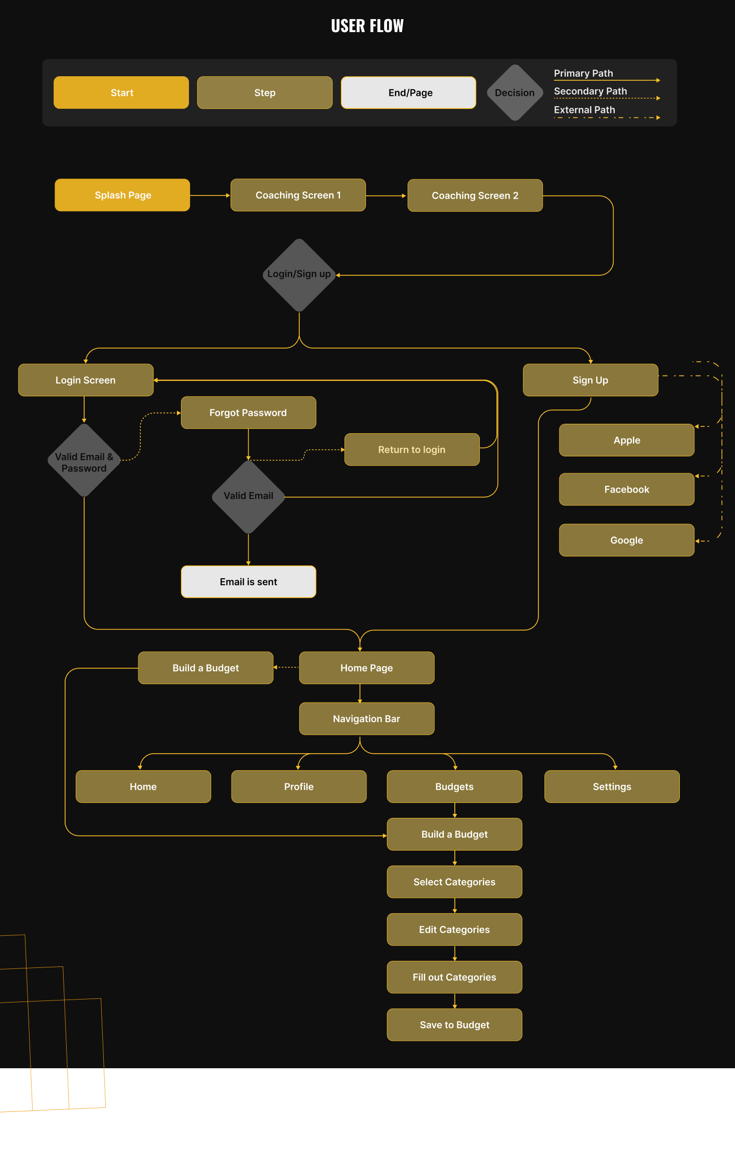
IDENTIFY NEEDS, EXPLORE SOLUTIONS

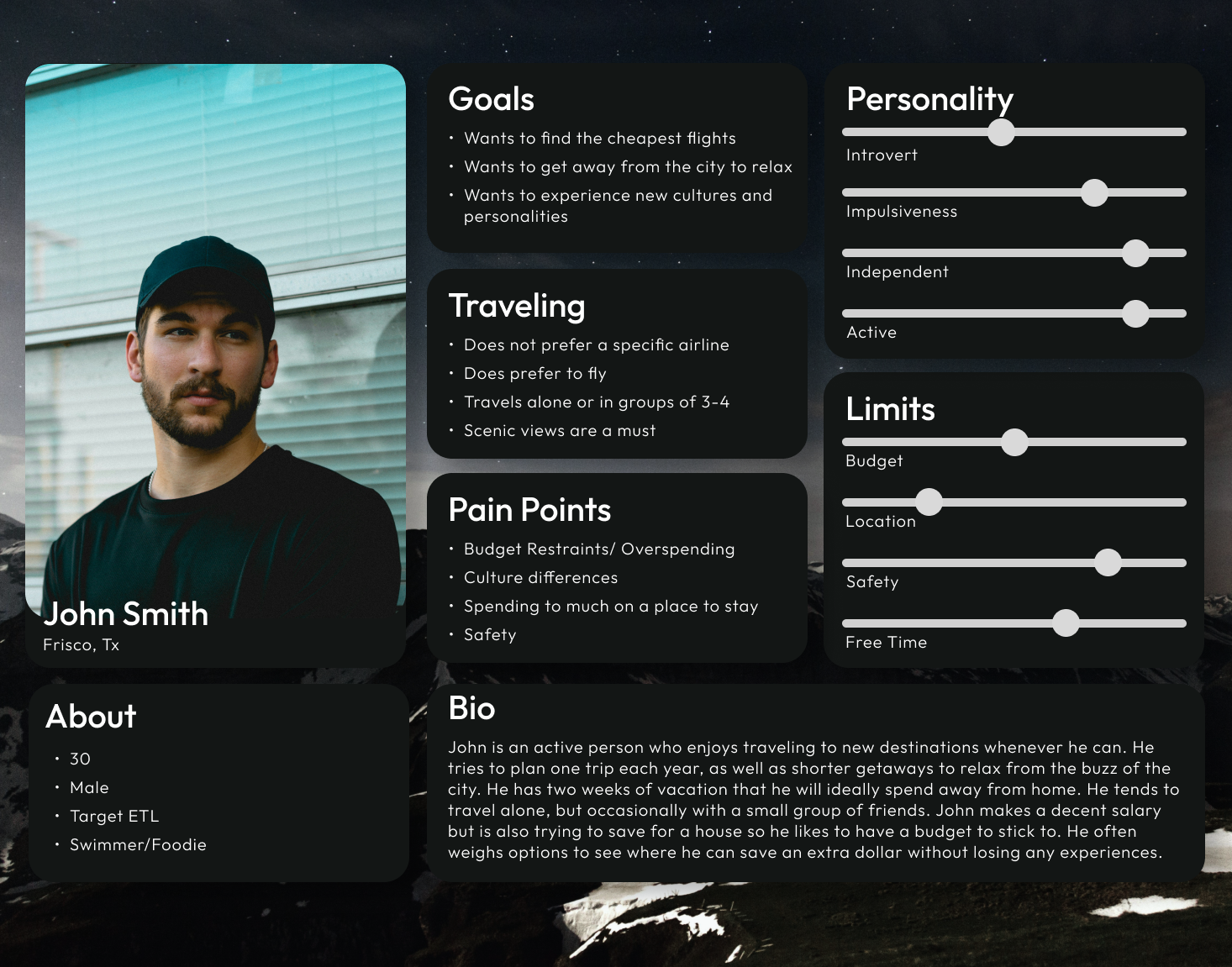
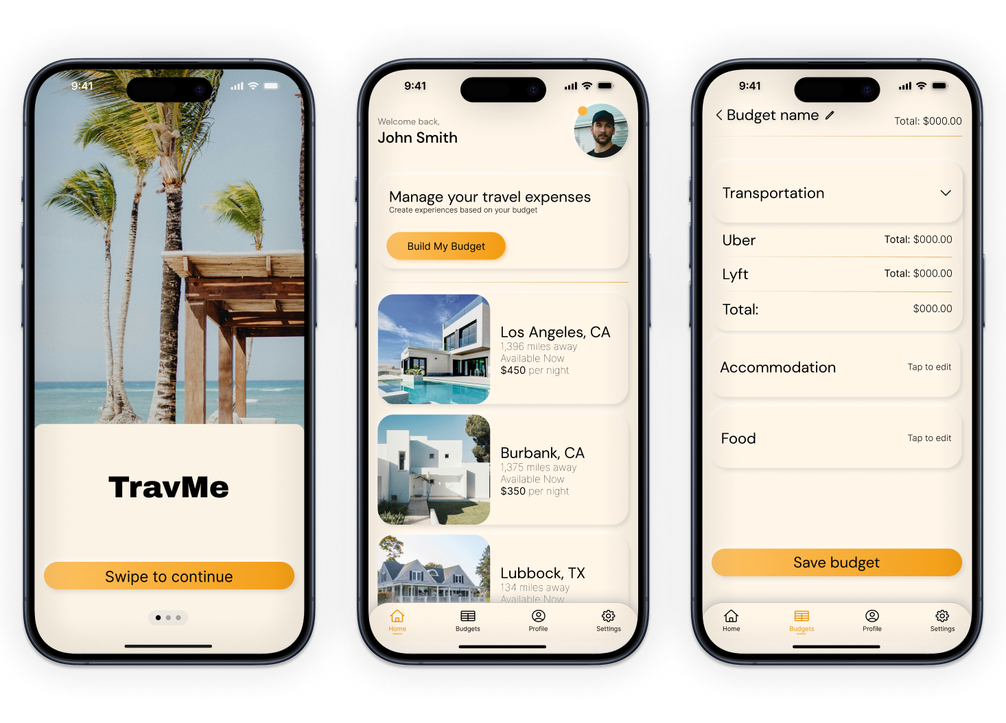
First, budget management emerges as a significant concern for travelers, indicating a need for features or services within the travel app that facilitate cost-effective planning while ensuring an enjoyable experience.

Second, the impact of the COVID-19 pandemic is evident in users' heightened attention to safety guidelines and travel budgeting, suggesting the importance of integrating real-time updates and relevant information regarding price updates into the app.

Third, the preference for traveling during non-peak seasons to avoid crowds and secure better prices underscores the significance of offering flexible scheduling options and providing insights into off-peak travel opportunities.

Overall, We chose to focus on the pervasive issue of overspending among young travelers by providing a platform that simplifies budget management during trips. By understanding the unique needs and preferences of young travelers, we seek to develop a platform that not only helps users set and track their budgets but also provides tailored recommendations and insights to enhance their overall travel experience. Through innovative features and a focus on user engagement, we aim to become the go-to solution for young travelers seeking to make the most of their budgets while exploring the world.

UX OPTION 1 - HAMBURGER MENU, DROP DOWN

low fidelity wireframe

UX OPTION 2 - BOTTOM NAV BAR, DROP DOWN

low fidelity wireframe

DEFINING THE USER

Through user interviews, we gathered valuable insights into the needs and preferences of our target audience. These conversations revealed key concerns such as budget management, safety guidelines, and a preference for non-peak travel. By analyzing this data, we were able to create a detailed user persona that embodies the typical young traveler. This persona will guide our design decisions and ensure that the app effectively addresses the real-world challenges faced by our users, ultimately helping us build a more user-centric and engaging travel app.

user-persona

PHASE 2

REFINE THE MOBILE EXPERIENCE

In refining the mobile experience, I led the team in defining a user flow that streamlined the travel planning process. We utilized a feature prioritization matrix activity to identify key functionalities and conducted an "I Like, I Wish, What If" activity to gather feedback and brainstorm improvements. Due to time constraints, we focused on two main features: the Budget Builder, which helps users manage their travel expenses effectively, and the Booking Rentals feature, allowing users to book accommodations at varying prices based on the day and time. These prioritized features ensure a seamless and user-centric experience.

user-flow

PHASE 3

LOOKS ARE IMPORTANT TOO

The UI process was pivotal in creating an appealing and intuitive interface for our travel app. We employed A/B testing and user testing to refine the design, ensuring it met user expectations and enhanced usability. Through these iterative tests, we arrived at a solid UI that incorporates a design technique called "neumorphism." This approach blends elements of skeuomorphism and flat design, creating a soft, realistic aesthetic that is both modern and user-friendly. The result is a visually engaging interface that enhances the overall user experience.

IN CONCLUSION

I've discovered the importance of understanding the intricate user journey within an application. Every minute detail plays a crucial role in shaping the user experience. Crafting a prototype was a fascinating endeavor with trying to come up with new and fresh designs. Furthermore, ensuring smooth and seamless functionality added another layer of complexity. Despite the challenges, I found immense satisfaction in the development process, from the initial stages of user research to the culmination in a polished digital prototype. This experience has not only expanded my understanding of user-centric design but has also instilled in me a deep appreciation for the intricacies of application development.

VIEW NEXT PROJECT

RE-DESIGNING
THE HOPE 4 KIDS
WEBSITE